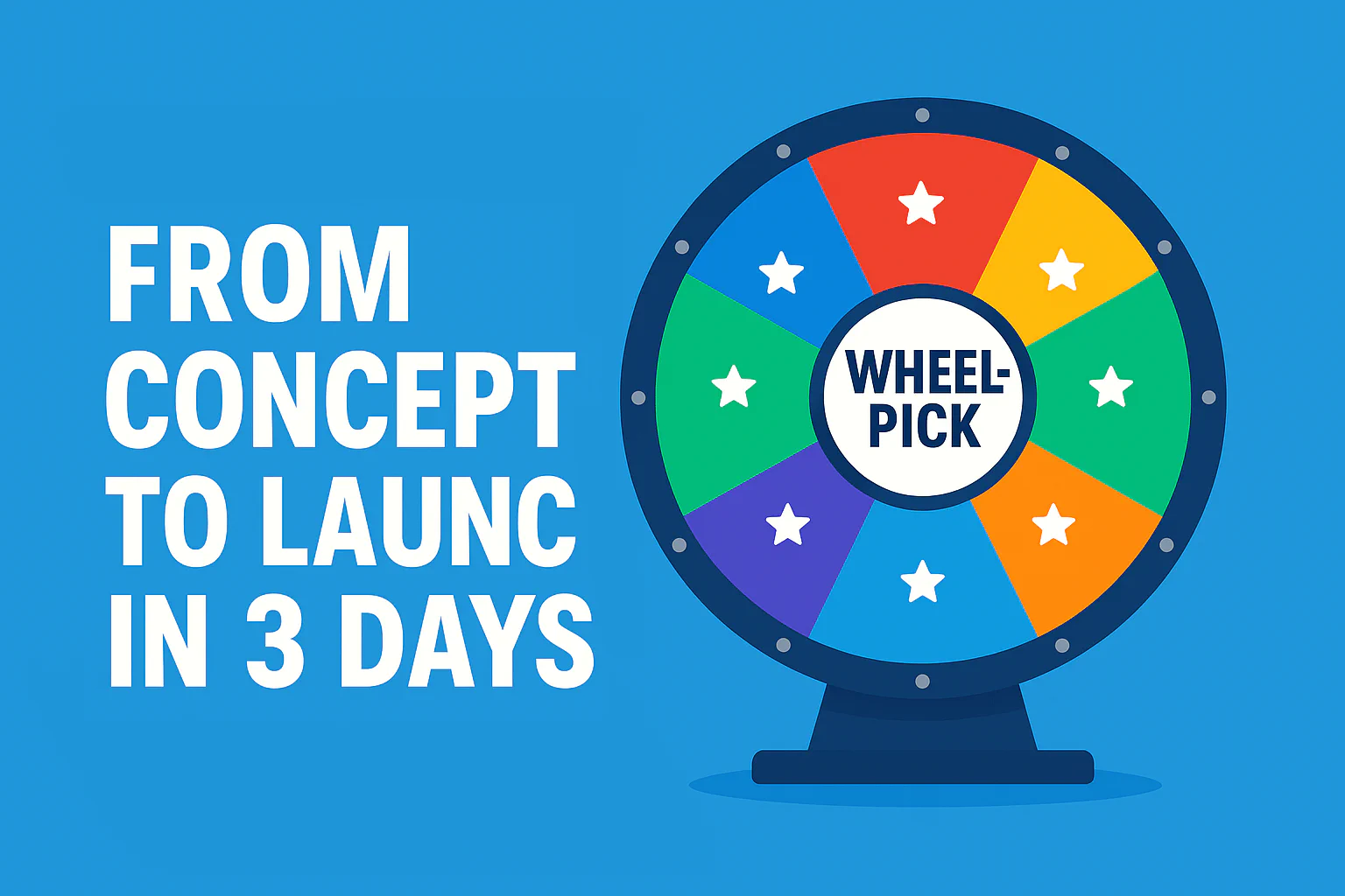
Building Wheel-Pick.com: From Concept to Launch in 3 Days
Have you ever been stuck in decision paralysis with friends over what movie to watch or restaurant to visit? That’s exactly the problem I set out to solve with wheel-pick.com — a free online wheel spinner tool that helps make random decisions fun and engaging.
In this post, I’ll take you through the entire journey of building wheel-pick.com from initial concept to public launch in just 3 days, sharing the technical challenges, design decisions, and valuable lessons learned along the way.
The Spark: Why Build a Decision Wheel?
The idea for wheel-pick.com came from a simple observation: people often struggle with making trivial decisions. Whether it’s choosing a movie genre for movie night or picking a restaurant for dinner, these small choices can sometimes lead to unnecessary debate.
While similar tools existed (like pickerwheel.com), I saw an opportunity to create something with:
- A cleaner, more modern UI
- Faster load times
- Better mobile experience
- No ads or distractions
Plus, I wanted a challenging side project to sharpen my JavaScript skills and experiment with the HTML5 Canvas API.
Technical Stack: Keeping It Simple
For wheel-pick.com, I deliberately chose a minimalist tech stack:
- Hugo for static site generation
- Vanilla JavaScript for interactivity
- HTML5 Canvas API for the wheel animation
- CSS3 with custom variables for styling
- AWS S3 + CloudFront for hosting and distribution
This “back to basics” approach had several advantages:
- No build process complexity
- Extremely fast load times
- Minimal dependencies
- Easy maintenance
Development Timeline: The 3-Day Sprint
Day 1: Research & Setup
- Analyzed existing wheel spinner tools
- Sketched UI wireframes
- Created project structure with Hugo
- Set up Git workflow and base styling
Day 2: Core Development
- Built the spinning wheel using the Canvas API
- Implemented realistic animation physics
- Integrated user input for wheel choices
- Added basic sound and result display
Day 3: UI Polish & Launch
- Made the interface fully responsive
- Enabled fullscreen mode and sharing
- Optimized assets for performance
- Deployed to AWS with CloudFront setup
Technical Challenges & Solutions
Challenge 1: Smooth Wheel Animation
Creating a physically realistic spinning wheel was harder than expected. The wheel needed to:
- Spin with realistic momentum
- Gradually slow down with proper easing
- Land precisely on a segment
- Work consistently across devices
Solution: I implemented a custom animation system using requestAnimationFrame with time-based animation rather than frame-based. This ensured consistent spinning speed regardless of device performance. The deceleration uses a quadratic easing function that mimics real-world physics.
const rotateWheel = function() {
  // Calculate time elapsed since last frame
  const elapsed = timestamp - lastTimestamp;

  // Use time-based animation for consistent speed
  spinTime += elapsed;

  if (spinTime >= spinTimeTotal) {
    stopRotateWheel();
    return;
  }

  // Quadratic easing for realistic deceleration
  const progress = spinTime / spinTimeTotal;
  const spinVelocity = startVelocity * (1 - Math.pow(progress, 2));

  // Update rotation
  currentRotation += spinVelocity;
  drawWheel();

  // Continue animation
  spinTimeout = requestAnimationFrame(rotateWheel);
};
Challenge 2: Mobile Experience
Making the wheel work well on mobile devices presented several challenges:
- Touch interactions needed to feel responsive
- The wheel and buttons needed to be properly sized
- Fullscreen mode required special handling
Solution: I implemented specific CSS for mobile viewports and added touch event handlers. For fullscreen mode, I created a special layout that maximizes the wheel size while keeping essential controls accessible.
Challenge 3: Sharing Functionality
I wanted users to be able to share their custom wheels with friends, which required:
- Generating shareable URLs with wheel configuration
- Handling URL parameters to reconstruct wheels
- Clipboard API integration for “Copy Link” functionality
Solution: I implemented a URL parameter system that encodes wheel choices and settings in the URL. The share button uses the modern Clipboard API with fallbacks for older browsers.
Design Decisions That Made a Difference
Color Psychology
I spent considerable time researching color psychology to create a palette that would:
- Reduce decision anxiety (blues and purples)
- Create a sense of fun and engagement (accent greens)
- Maintain visual harmony (60-30-10 color rule)
The final palette uses:
- Primary blues (#4D77FF) for trust and reliability
- Secondary purples (#6930C3) for creativity and wisdom
- Action greens (#4CAF50) for growth and progress
Minimalist UI
I deliberately kept the UI clean and focused:
- Only essential controls visible by default
- Options tucked away in expandable sections
- Clear visual hierarchy with the wheel as the focal point
Sound Design
Sound effects were carefully chosen to:
- Build anticipation during spinning
- Create satisfaction at the result reveal
- Be pleasant but not annoying with repeated use
Lessons Learned
1. Start with MVP, Then Iterate
I initially planned too many features. By focusing first on the core spinning wheel functionality and then adding features incrementally, I maintained momentum and had a working product much sooner.
2. Test Early and Often on Real Devices
Emulators aren’t enough! Some of the most frustrating bugs only appeared on specific mobile devices. Regular testing on physical phones and tablets saved me from post-launch emergencies.
3. Performance Matters More Than Features
Users care more about speed and reliability than fancy features. Keeping the codebase lean and optimizing for performance paid off in user satisfaction.
4. Git Flow is Worth the Effort
Using a structured Git workflow with feature branches and hotfixes kept the project organized, especially when fixing last-minute issues before launch.
The Launch and Beyond
Launching wheel-pick.com was just the beginning. Since the initial release, I’ve:
- Gathered user feedback through analytics and comments
- Fixed bugs and alignment issues in hotfix releases
- Planned new features based on user requests
- Optimized for better search engine visibility
Key Metrics and Results
- Load Time: 0.8 seconds (compared to 2.5+ seconds for competitors)
- Mobile Usage: 68% of users access the site on mobile devices
- Engagement: Average session duration of 2.5 minutes
- Organic Growth: 15% week-over-week growth in users
Conclusion: What Would I Do Differently?
If I were to start over, I would:
- Set up automated testing from day one
- Create a more structured design system before writing CSS
- Spend more time on cross-browser testing earlier in the process
- Plan for internationalization from the beginning
Building wheel-pick.com was a reminder that sometimes the most useful tools are the simplest ones. By focusing on solving a specific problem well rather than adding every possible feature, I created something that people actually enjoy using.
Have you used wheel-pick.com? What other simple tools would you like to see built? Let me know in the comments!